Editing a theme
PingOne delivers several built-in themes. Use the Branding and Themes page to modify the built-in themes or themes that you’ve added to the environment to better match your company’s branding. The customized themes use your Company Name and Logo if you added them in Global Settings.
|
If you edit a theme, you are responsible for ensuring that your customizations meet accessibility standards. |
Steps
-
In the PingOne admin console, go to User Experience > Branding and Themes and browse or search for the theme you want to edit.
-
To change the theme name, click the More options (⋮) icon and select Edit Name.
-
Update the Theme Name and click Save.
-
To customize the other settings for the theme, click the More options (⋮) icon and select Edit Theme.
Page previews display in the left panel, and you configure the settings in the Theme Styles panel on the right. The previews update in real time as you make changes to the settings. To switch between previews for desktop or mobile devices, click the Desktop or Mobile icon (
 ).
).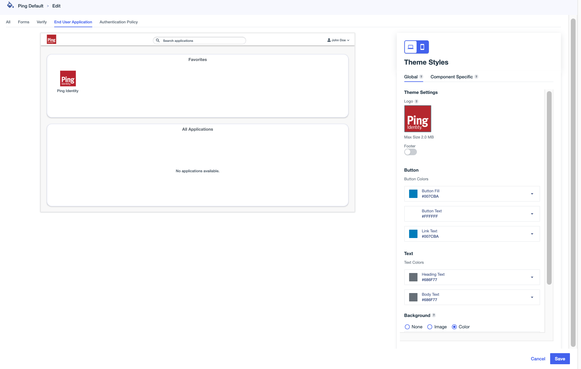
All page types include global theme settings, which apply across all components. Some page types also have Component Specific settings, which apply only to the specific component.
-
Click the All tab to edit global theme settings that apply to all pages that aren’t affected by component-specific styles.
Setting Description Logo
An image to represent the environment. Hover over the box and click the Camera icon () to upload an image. Select an image in
.jpg,.jpeg,.gif, or.pngformat up to 2 MB in size.To change the image used for the logo, click and select Upload New Image.
To delete a logo from a theme, click and select Remove Image.
Footer
Text that appears at the bottom of each page. Click the toggle to the right (blue) to enable footer text, then enter the text.
You can include HTML in the footer, including the following elements and attributes:
-
a(href, target)To use an
href, you must include the protocol in the address, such asftp,http,https,mailto,tel, orsms. -
b -
blockquote(cite) -
br -
cite -
code -
dd -
dl -
dt -
em -
i -
li -
ol -
p -
pre -
q(cite) -
small -
span -
strike -
strong -
sub -
sup -
u -
ul
Button
Configure the color of the buttons, such as the Sign on and Save buttons:
-
Button Fill: The background color for the buttons.
-
Button Text: The color of the text on the buttons.
-
Link Text: The color of the text for links displayed on the buttons.
Text
The color of the text on the pages:
-
Heading Text: The color of the text in headings.
-
Body Text: The color of non-heading text.
Background
The background to use on each page.
-
None: Do not use a background.
-
Image: To use an image for the background, hover over the box and click the Camera icon () to upload an image. Select an image in
jpg,jpeg,gif, orpngformat up to 2 MB in size.To change the image used for the background, click and select Upload New Image.
To delete a background image from a theme, click and select Remove Image.
-
Color: Select a color to use for the background.
Card Color
The color of the box around form fields.
-
-
Click the Forms tab to edit global theme settings and preview the updated appearance of the PingOne forms in your environment.
There are no component-specific styles for Forms.
Your selections affect all forms, and can’t be set at the form level, but you can select a form from the Form Preview list to preview it with theme styling applied. You can also click Edit Form to open the Forms page in a separate tab and make updates as necessary.
Learn more in Forms.
-
On the Verify tab, click one of the tabs in the Theme Styles panel:
-
Global: Edit global theme settings and preview the updated appearance of identity verification pages.
-
Component Specific: Edit settings that only affect the appearance of the images on identity verification pages.
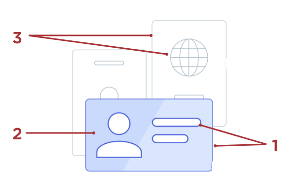
Setting Description Foreground Main (1)
The color used for the border around the front image and around the internal shapes in the front image.
Foreground Highlight (2)
The fill color used for the front image.
Background Outline (3)
The color used for the borders around the background images and around the internal shapes in the background images.
-
-
On the End User Application tab, click one of the tabs in the Theme Styles panel:
-
Global: Edit global theme settings and preview the updated appearance of system applications, such as the Application Portal and Self-Service - My Account.
-
Component Specific: Edit settings that only affect the appearance of system applications, such as the Application Portal and Self-Service - My Account.
Setting Description Background Color
The background color used for the application.
-
-
Click the Authentication Policy tab to edit global theme settings and preview the updated appearance of the sign-on and registration pages in your environment.
There are no component-specific styles for Authentication Policy.
-
Click Save.